Lo-Fi Prototypes: What to Include (And What to Skip)
Picture your team gathered around a conference table on a Tuesday morning, trying to agree on a new onboarding layout. You have a detailed written specification in front of you, but words often leave too much room for interpretation. Converting text-based requirements into interactive logic is a shared industry challenge. Product managers and design partners frequently need a fast, visual way to align everyone on the core mechanics before committing technical resources.
When you prioritize structural validation over pixel perfection, your team can rapidly course-correct early in the product journey. By exploring the foundations of early mockups, teams can create clear deliverables that bridge the gap between abstract ideas and handoff-ready specifications.
The Core Components: What Should a Low-Fidelity Prototype Include?
A low-fidelity prototype should include essential user flows, basic layout structures, and core functionality placeholders. It focuses exclusively on the user journey and information architecture. You want clear action paths that encourage team discussion without getting bogged down in visual styling.
When asking what should a low-fidelity prototype include, the answer revolves entirely around early validation. These prototypes act as conversational tools for your team. They strip away the visual polish, ensuring that cross-functional peers concentrate on the logic of the experience. According to a comprehensive 2026 guide by F22 Labs, low-fidelity formats are intentionally rough to encourage broad feedback and iteration. This approach has been shown to reduce iteration cycles by up to 40% in early-stage product development.
The purpose of low-fidelity prototyping is to build a discardable, lightweight version of your concept. Teams utilize these layouts to ask fundamental questions about product direction. If the underlying logic is flawed, your team can pivot immediately without feeling emotionally attached to a highly polished file.
Clear Structural Layouts Over Pixel Perfection
Clear structural layouts focus on the spatial arrangement of elements rather than distinct branding or visual design. Your layout should define where navigation menus, content blocks, and primary action buttons live on the screen. This skeletal framework helps users understand the basic hierarchy of information.
In our testing, prioritizing layout over design prevents stakeholders from debating color choices during early stages. You can outline containers using simple boxes and gray tones. This approach clarifies the scale of different interface elements. By keeping the visual representation simple, you ensure the team evaluates usability rather than aesthetics.
Essential User Flows and Action Paths
Essential user flows map out the direct sequence of steps a person takes to accomplish a primary goal. Your prototype must clearly indicate how a user navigates from the starting screen to the final success state. You should map out the clicks, transitions, and decision points that drive the core journey.
When defining basic prototype elements, the "happy path" is your immediate priority. Teams can sketch multiple approaches to a user flow in the exact same time required to build one detailed mockup. Evaluating these primary action paths early ensures your core value proposition actually makes sense to the end user.
Functional Placeholders for Content
Functional placeholders are generic text blocks, standard shapes, and simple icons that represent future content. You use these basic elements to indicate where a headline, user avatar, or descriptive paragraph will eventually sit. Placeholders give the interface context without requiring finalized copywriting.
You do not need finalized marketing copy to test a concept. Simple labels like "User Profile Picture" or "Submit Order Button" provide enough context for reviewers.
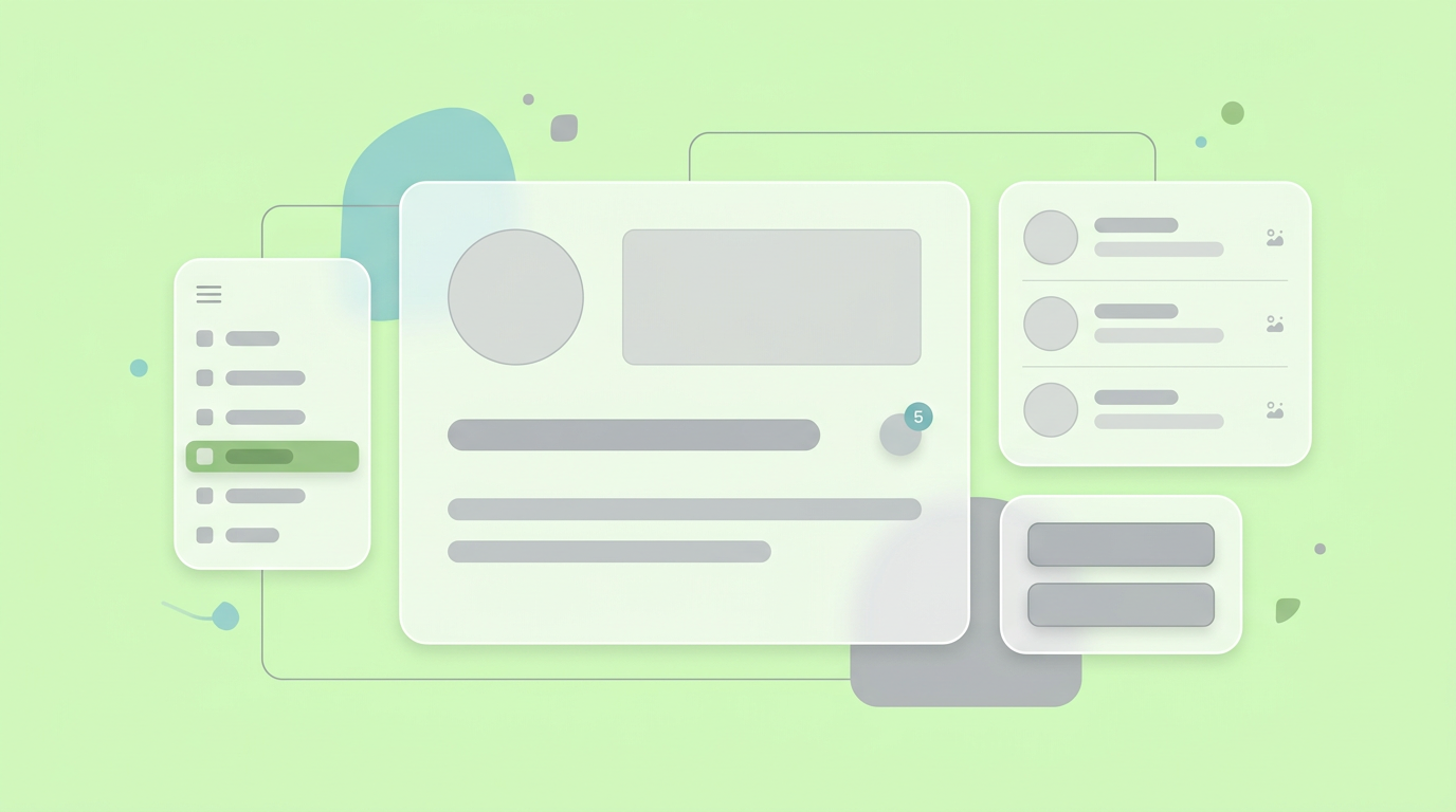
Using these placeholders accelerates the creation process, allowing you to validate the information density of a screen rapidly.
Step-by-Step Guide to Creating Effective Low-Fidelity Wireframes
Creating effective low-fidelity wireframes requires defining specific testing goals, mapping out the core user paths, and sketching functional elements. By moving step-by-step through structural decisions, you ensure your team aligns on the core experience before touching a design system.
Product managers often seek a structured approach to ideation that consistently produces actionable results. Establishing a clear, repeatable process ensures your low-fidelity mockups definition remains focused on utility rather than artistry. Taking a deliberate approach helps validate concepts efficiently.
As you build out your process, sharing realistic low-fidelity wireframe examples with your engineering peers sets the right expectations. They need to understand the structural intent without assuming the design is final.
Step 1: Define the Prototype’s Core Objective
Defining the core objective involves clarifying the specific questions your team needs to answer through testing. You must establish whether you are testing navigation logic, feature comprehension, or task completion speeds. Setting a clear goal prevents scope creep during the drafting phase.
Before sketching a single box, document the primary user task. Are you evaluating a complex checkout process or a simple password reset? Knowing the exact objective keeps your iterations tightly focused. This strategic framing ensures every screen serves a distinct purpose.
Step 2: Map the Information Architecture
Mapping the information architecture requires organizing screen content to reflect the user's mental model. You must group related features logically and establish a clear hierarchy that guides the user's eye. This step guarantees that important actions are prominent and secondary actions are tucked away.
You can outline this architecture using simple bullet points or a whiteboard tree structure. Once the hierarchy is established, transitioning to a digital canvas becomes much faster. Getting the architecture right early on saves countless hours of revision. For a deeper look at early validation, consider exploring How to Validate a Product Idea Quickly Before Writing Code.
Step 3: Sketch the Layout and Gather Feedback
Sketching the layout requires quickly translating your architecture into simple graphical representations. You then share these rough screens with stakeholders to gather conceptual feedback on the overall flow. This phase is characterized by rapid iteration based on direct observations.
Do not worry about precision during this step. If a button is slightly off-center, ignore it and focus on whether the user understands its function. According to best practices from Parallel HQ, intentionally rough sketches encourage reviewers to suggest foundational changes.
What to Skip During Early Prototyping Stages
During early prototyping, skip all visual styling like colors, typography choices, and branding assets. You must also avoid building complex micro-interactions, elaborate animations, and deep edge cases. Leaving these out keeps the focus strictly on evaluating the broad product concept.
Knowing what is an lo-fi prototype also means understanding its intentional limitations. When product teams try to include too much detail too soon, they drastically reduce their iteration speed. Detailed polish often triggers premature feedback on visual preferences. Your goal is to keep the conversation centered on functionality and flow.
By omitting unnecessary details, you empower your team to pivot rapidly without wasting administrative effort. The simplest approach is often the most effective method for testing core assumptions.
Colors, Branding, and High-Fidelity Typography
Adding brand colors, custom typography, and corporate logos creates a false sense of finality in early models. You should strictly use gray scales, standard system fonts, and generic shapes. This visual neutrality prevents stakeholders from critiquing the aesthetic execution of the brand guidelines.
When a layout looks too polished, reviewers subconsciously assume the underlying logic is finalized. They will spend meetings debating the shade of blue on a primary button rather than questioning why the button exists. Keeping the design visually basic forces everyone to evaluate the actual user journey.
Complex Micro-Interactions
Complex micro-interactions include hover states, loading animations, and intricate transition effects between pages. You should omit these entirely from your early drafts because they require significant time to build and convey very little about the core product logic. Focus purely on static screen-to-screen navigation.
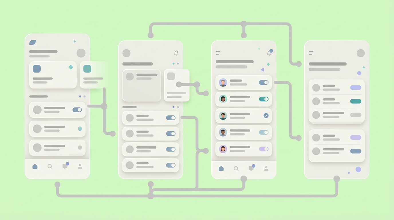
Building advanced interactions in tools like Figma consumes valuable time that could be spent testing alternative layouts. Evaluating broad concepts does not require you to show how a dropdown menu animates. Stick to simple click-through mechanics to validate user comprehension.
Edge Cases and Error States
Edge cases and error states represent the uncommon or incorrect paths a user might take through a system. You should initially ignore these scenarios to concentrate entirely on the primary "happy path." Designing every possible error message upfront slows down the momentum of early validation.
We found that focusing strictly on the successful completion of a task provides the best baseline for usability. Once the team agrees that the core flow works, you can map out the failure states in a later iteration. Evaluating the primary journey first is critical.
Integrating Low-Fidelity Mockups Into Your 2026 Workflow
Low-fidelity mockups fit into modern 2026 workflows by acting as the initial bridge between product requirements and early design exploration. Teams use them to validate logic rapidly before committing resources to high-fidelity files. This step ensures cross-functional peers share a unified vision.
Adapting your workflow to include rapid structural testing protects your engineering budget and improves team morale. Tooling has evolved rapidly, and foundational tools built by industry veterans are leading the charge. Supporting these workflows requires an environment that values speed over early perfection.
Integrating these methods helps maintain high velocity while ensuring product managers and design partners stay closely aligned on the user experience.
Using AI Subagents to Accelerate the Process
AI subagents assist product teams by rapidly generating initial layouts based on written specifications. You can supply your basic requirements, and these tools will instantly construct skeletal wireframes for you to review. This automation drastically reduces the time spent drawing rudimentary shapes.
Rather than starting from a blank canvas, you begin with a fully functioning structural draft. You can then quickly modify the AI-generated layout to suit your exact needs. This rapid generation cycle keeps the momentum high during sprint planning sessions.
Bridging the Gap Between PMs and Designers
Low-fidelity layouts act as a universal language between product managers and design professionals. You can present a structural concept, and your design partner will immediately understand the intended functionality. This shared visual context eliminates the misunderstandings commonly associated with text-heavy Jira tickets.
When both roles collaborate on a basic wireframe, they establish mutual agreement on the product architecture. The designer can then confidently transition the layout into a polished, branded interface. This cooperative approach minimizes rework and frustration.
Transitioning from Sketch to Handoff-Ready
Transitioning requires taking approved low-fidelity layouts and systematically layering on design systems and high-fidelity details. You use the validated structural prototype as a strict blueprint for the final product. This ensures the final deliverable remains true to the tested and approved user logic.
By the time the file reaches the engineering team, all functional questions have been answered. The developers receive a clear, documented flow that is ready for production. To master this transition, review our guide on Beyond Mockups: Agile Handoffs in 2026.
Shaping Ideas for Faster Alignment
Smart early-stage prototyping accelerates alignment by stripping away visual distractions to focus purely on product logic. When you prioritize structure and user flows early on, you create a solid foundation that shortens the overall path to development.
Embracing a lightweight approach to idea validation empowers your entire product team to work efficiently. By identifying exactly what belongs in your early mockups and what should wait, you maintain high velocity and clear communication. The goal is always to build confidence in the product direction before building the product itself.
Foster collaboration and early feedback
These prototypes serve as conversational tools. They help gather diverse perspectives and identify potential issues before significant resources are committed. Encouraging feedback at this stage ensures a shared understanding across the team.
For teams looking to centralize this critical phase of the journey, utilizing the AI-driven workspace at Dazl helps turn early concepts into shareable, functional realities.
You and your team can refine these structural layouts and validate your product logic by signing up for Dazl.
Get Started